


Realizing how important mobile browsing has become, Google made a significant decision in 2020. They began prioritizing the mobile version of websites, calling it the “mobile-first index”.
Mobile-first indexing means Google looks at the mobile version of a site before its desktop version when deciding how to rank it in search results. This change has big implications on website owners.
In this guide, we will break down how mobile-first indexing will impact your website and what you need to do to make sure your site ranks well in Google’s search results.
1. Mobile version vs. desktop version:
First of all, you need to have both desktop and mobile versions of your site work well. However, with mobile-first index, the mobile version becomes the primary version Google considers.
Even if your website looks and works great on a desktop computer, if it’s not optimized for mobile devices, it might not rank as high in Google’s search results.
What to do
If you own a website, you should make sure that the content, structured data, and meta tags on your mobile site are the same as on your desktop site.
If there are differences between the two, your website might not rank as well in Google search results.
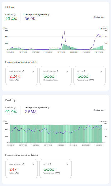
2. Google search console:
Website owners should regularly check the Google search console.
Google search console tools provide insights into how your site performs on mobile devices and highlight any mobile errors.
Google mobile usability report
What to do
Staying updated with the search console can help website owners address issues promptly, specifically:
- Mobile device problems: The console points out any mobile-related technical issues on your site like broken links or pages that don’t load correctly. Fixing these ensures a better experience for visitors and can improve your site’s ranking in Google search results.
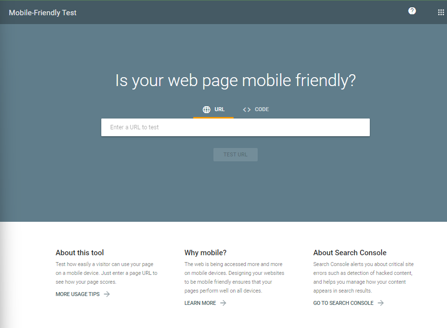 The Google Console mobile friendliness test tool
- Check mobile performance: You get a clear picture of the overall user experience on mobile. It’s about how fast pages load, how easy it is for users to navigate, and whether the layout is user-friendly on mobile devices.
- Prepare for mobile-first indexing: Google now prioritizes mobile sites in search results. The console guides you in optimizing your mobile site to align with this approach.
- Ensure data consistency: The tool ensures that important data, like links, are consistent across mobile and desktop versions of your site.
3. Separate mobile URLs:
Some websites have separate mobile URLs (like “m.example.com”). If you’re one of them, ensure that Google can access both versions.
What you should do
Google needs to understand the relationship between your desktop and mobile sites.
If you’re a website owner, here’s what you should do:
- Accessibility: Make sure both your mobile and desktop sites are accessible to Google. If one version is blocked or has errors, it could impact how your site is indexed and ranked.
- Consistency in content: Ensure that the content on your mobile site is the same as your desktop site. If your mobile site has less content, consider updating it to match the desktop version.
- Tags and metadata: Properly set up tags, especially the robots meta tags, on both versions. This helps Google understand which pages to crawl and index.
- Relationship between versions: Google should be able to understand the relationship between your desktop and mobile sites. This can be achieved by using the correct canonical URL, or more specifically, rel=canonical and rel=alternate link elements. The desktop URL is always considered the canonical, and the mobile version is the alternate.

4. Structured data and metadata:
Structured data and metadata are pieces of code that provide information about the content on your website.
This information helps search engines understand the context of your content. For example, structured data can tell search engines that a particular number on your site is the price of an item, or that a string of text is a review.
Recommendations
To make sure Google accurately understands and presents your site in search results, it’s important to keep the structured data and metadata consistent across both mobile and desktop versions of your site. Here’s how you can do that:
- Same structured data: Make sure the structured data is the same on both versions. If you have structured data on your desktop site, it should also be on your mobile site.
- Correct URLs in structured data: When using structured data on your mobile site, ensure that the URLs mentioned are the mobile URLs, not the desktop ones.
- Consistent metadata: The title elements and meta descriptions should be the same on both versions of your site. This helps your site look consistent in search results, no matter which version is being accessed.
Impact of inconsistency
If there’s a mismatch in the structured data and metadata between the mobile and desktop site:
- Confusion for Google: Google might not index your site correctly, which can change how your site appears in search results.
- Potential ranking issues: Your site could rank lower because Google mainly uses the mobile version for indexing and ranking with its mobile-first indexing approach.
Tools to help
You can use tools like Google’s data highlighter and URL inspection tool to check and make sure the structured data and metadata are correctly set up on both versions.
5. Mobile page speed:
Google’s mobile-first indexing means that Google primarily evaluates the mobile version of your website for its search rankings. Given the increasing number of mobile users, a fast-loading mobile page ensures a better user experience.
Impact
- Lost traffic: Slow mobile pages can result in higher bounce rates, meaning users leave your site without interacting further.
- Reduced conversions: If users leave due to slow page speeds, it can lead to fewer conversions, be it sales, sign-ups, or other desired actions.
Steps to improve mobile page speed
- Analyze your site: Use tools like Google’s PageSpeed Insights or Google Search Console to identify areas of improvement.
- Optimize images: Large images can slow down your page. Compress them without compromising quality.
- Minimize code: Clean up your site’s code by removing unnecessary characters, spaces, and comments.
- Leverage browser caching: Store parts of your site in the user’s browser so they don’t have to reload everything each time they visit.
- Reduce redirects: Each redirect triggers an additional HTTP request, slowing down page load time.
- Prioritize above-the-fold content: Ensure content at the top of the page loads first, so users have something to engage with while the rest of the page loads.
- Use content delivery networks (CDNs): CDNs can distribute the load, saving bandwidth and speeding up access for users.
Getting a freelance consultant’s help
Navigating mobile-first indexing can be complex. If you’re unsure about making the right adjustments to your website, consider seeking a freelance consultant’s expertise.
Here at Right People Group, we can connect you with professionals who specialize in this area. Working with a consultant offers tailored advice, helps you avoid common pitfalls, and ensures your site is optimized for the best search results.
Interested? Contact us to find the expert that fits your needs, fast.

Conclusion
The shift to mobile-first indexing is not just a technical change; it’s a reflection of our changing habits. As website owners, understanding and adapting to this change is crucial to ensure that your site remains visible and relevant in Google’s search results. For more information about mobile-first indexing, visit Google Seach Central.